Paper Stone
POSM Revamp fpr
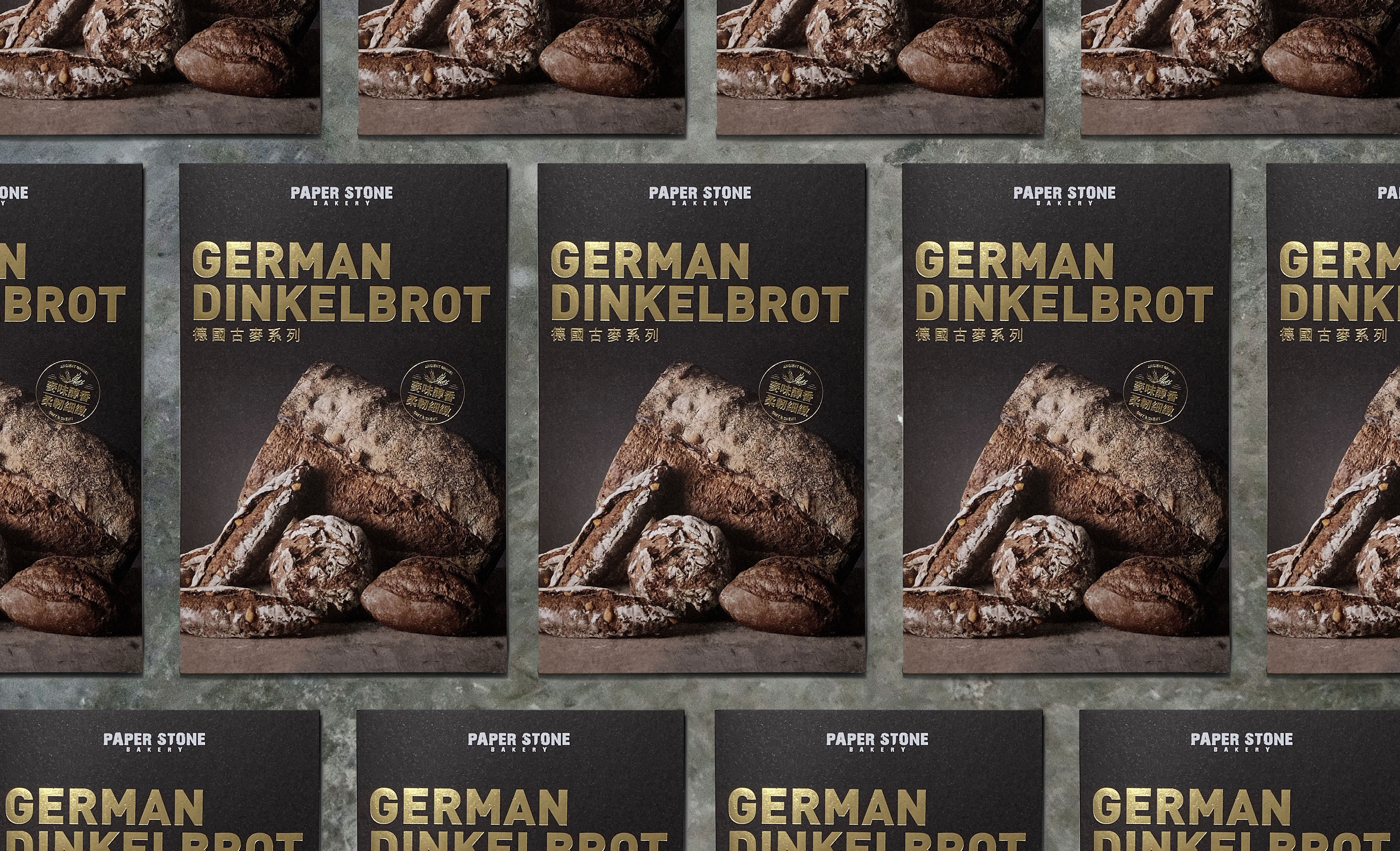
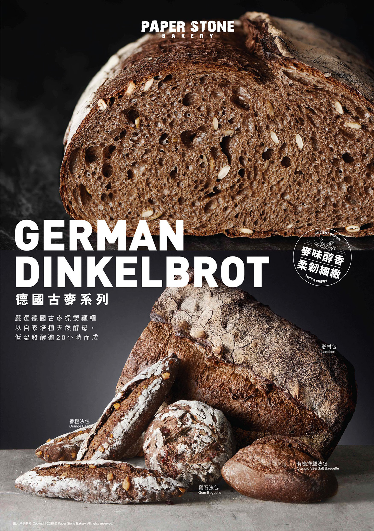
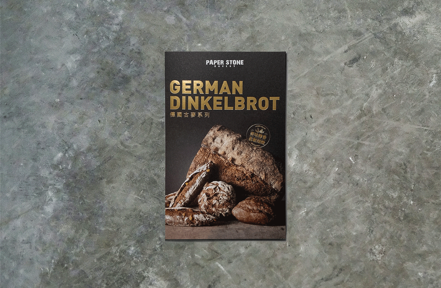
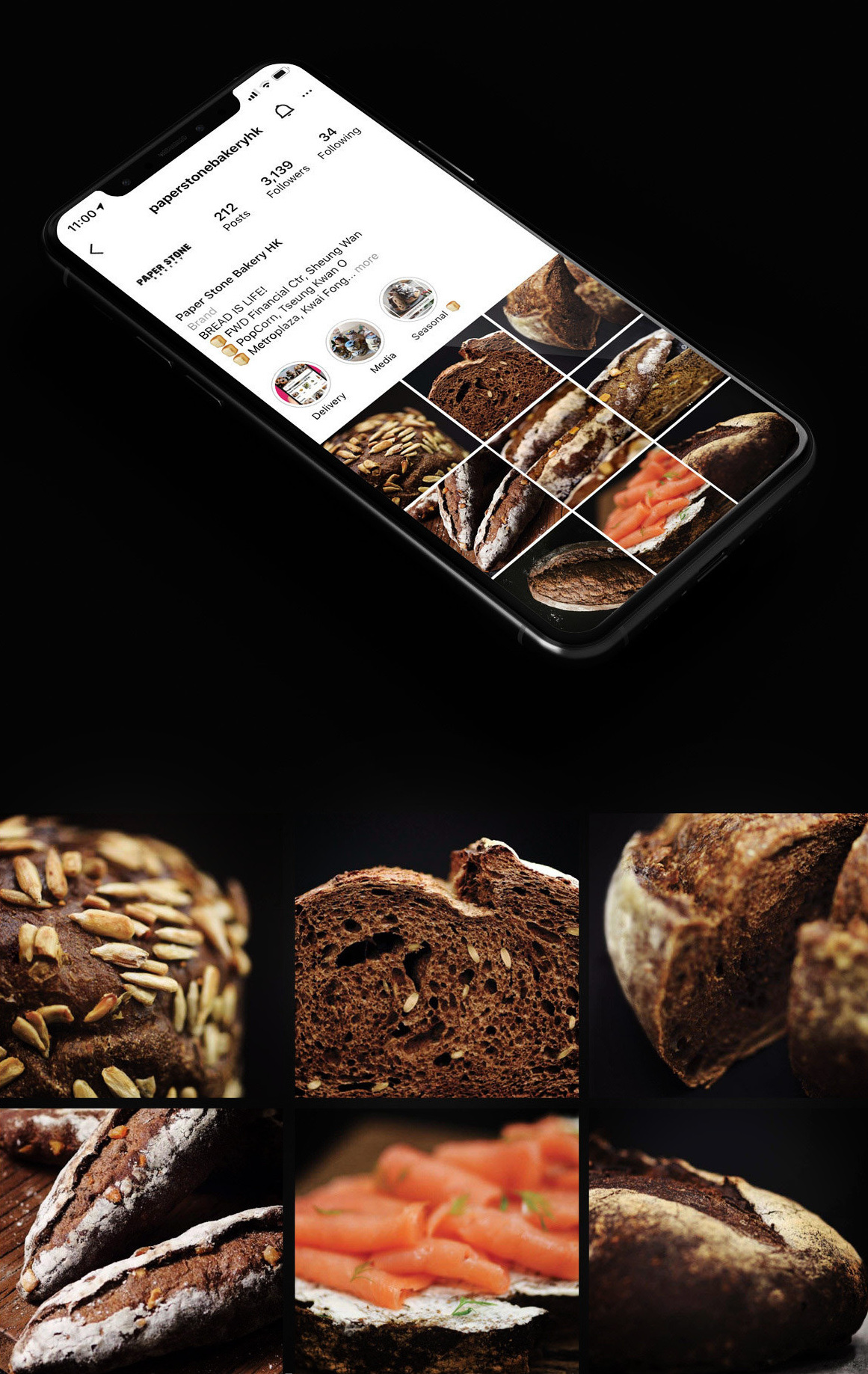
German Dinkelbrot Series
Art DirectionArt Direction & Execution, including KV, POSM, leaflet, social, etc
THE CONCEPT
With the task to revamp the existing POSMs and develop a master layout for the brand to follow in all upcoming campaigns based on this series, we hope to give a clearer grid for the layouts with standard font, logo position, and a mark highlighting the USP of that series. We highlight the products’ benefit, e.g. its appealing texture in close-up shots on top while showing the whole collection at the bottom in a clean and artistic way.
With the task to revamp the existing POSMs and develop a master layout for the brand to follow in all upcoming campaigns based on this series, we hope to give a clearer grid for the layouts with standard font, logo position, and a mark highlighting the USP of that series. We highlight the products’ benefit, e.g. its appealing texture in close-up shots on top while showing the whole collection at the bottom in a clean and artistic way.
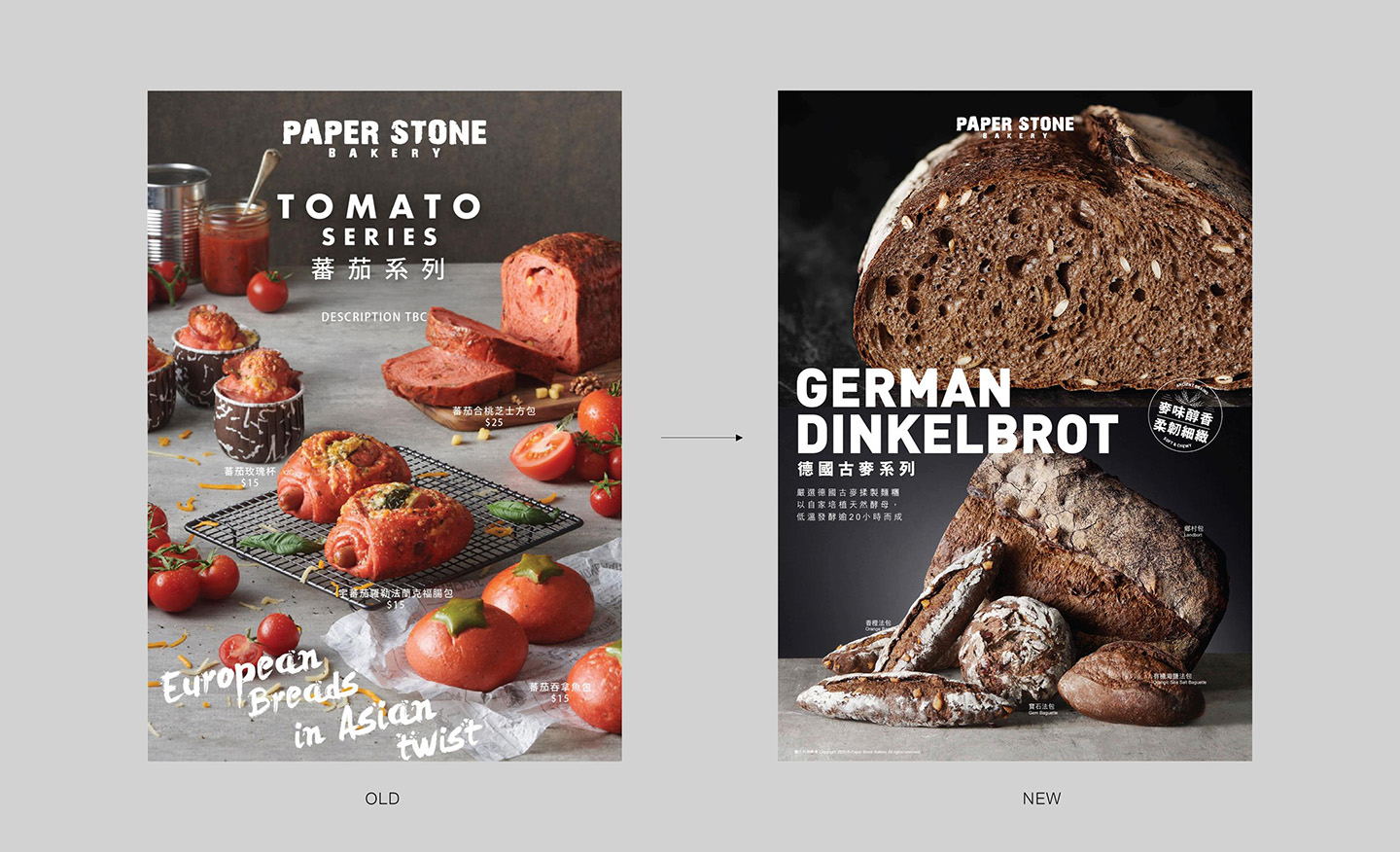
The Change - A clearer grid is presented in a more focused way
Work at Maxim’s with the team as below:
Supervised by Brand Experience Manager: Luke
Design by Myself
Photographer: Martin (POSM) & Sander (Social)
Supervised by Brand Experience Manager: Luke
Design by Myself
Photographer: Martin (POSM) & Sander (Social)